Project
NASA App Redesign
Description
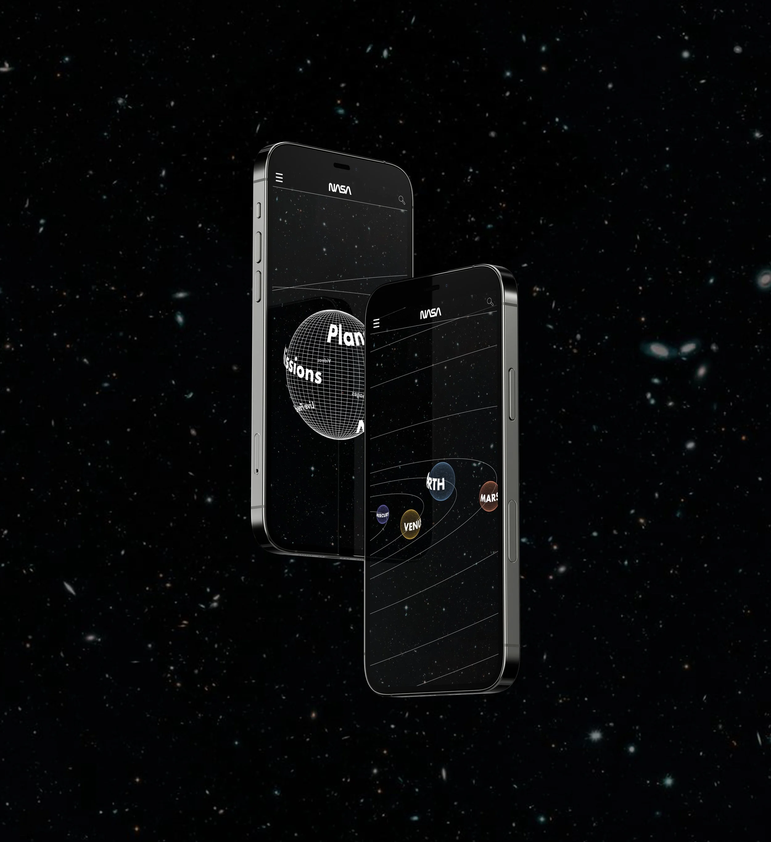
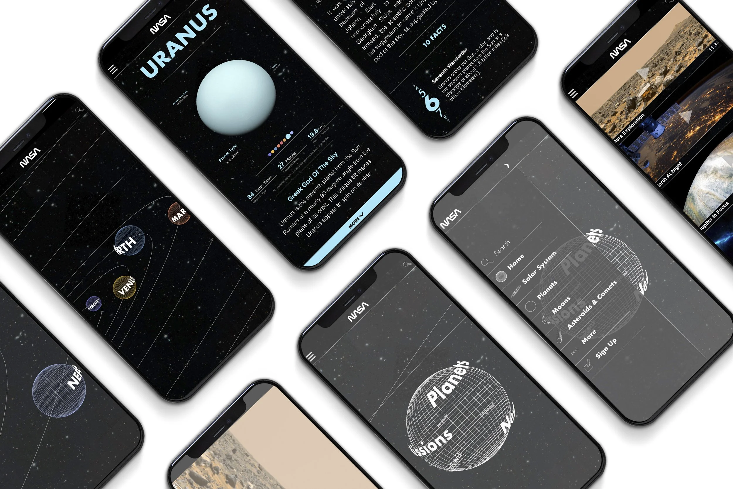
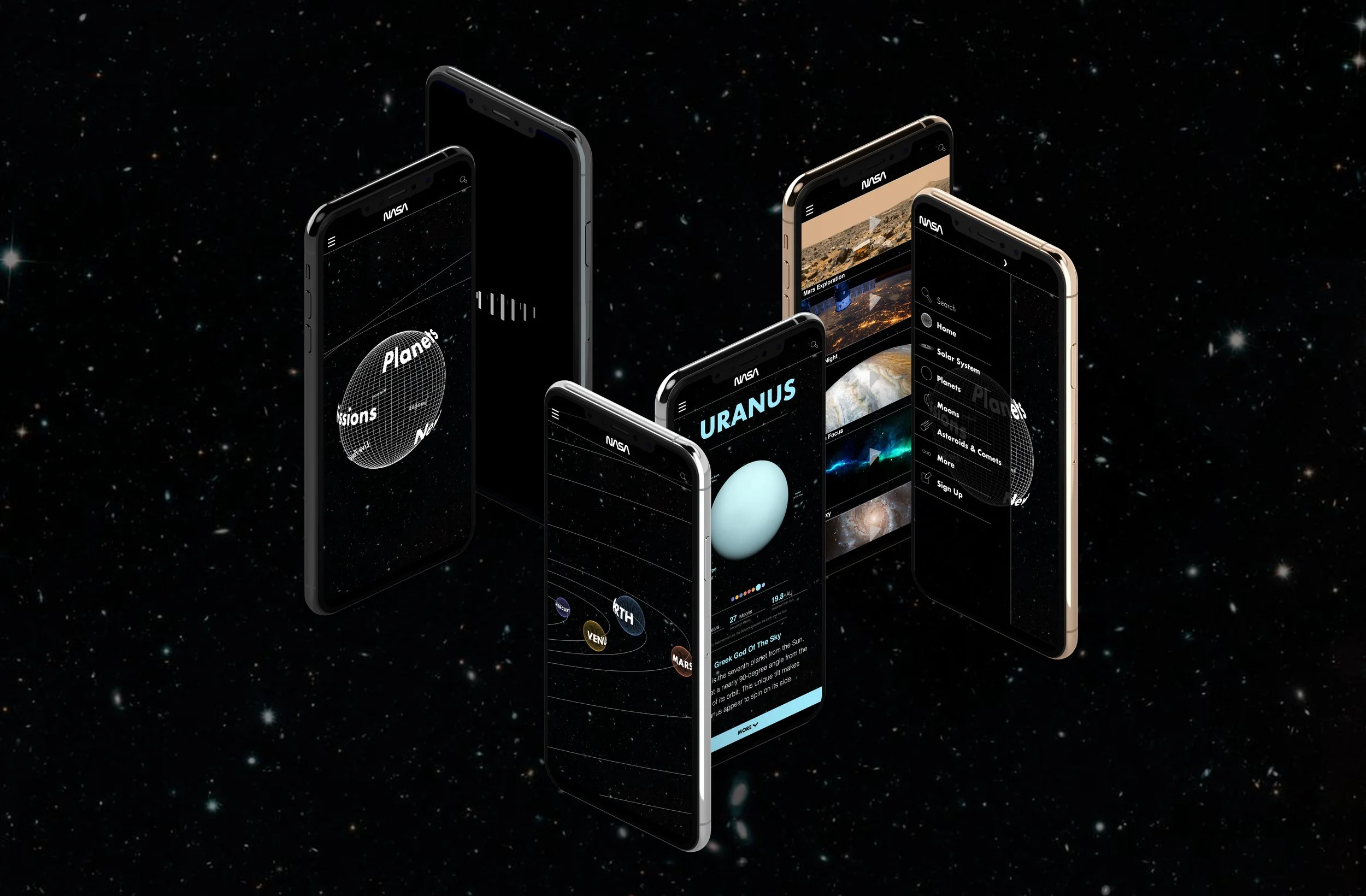
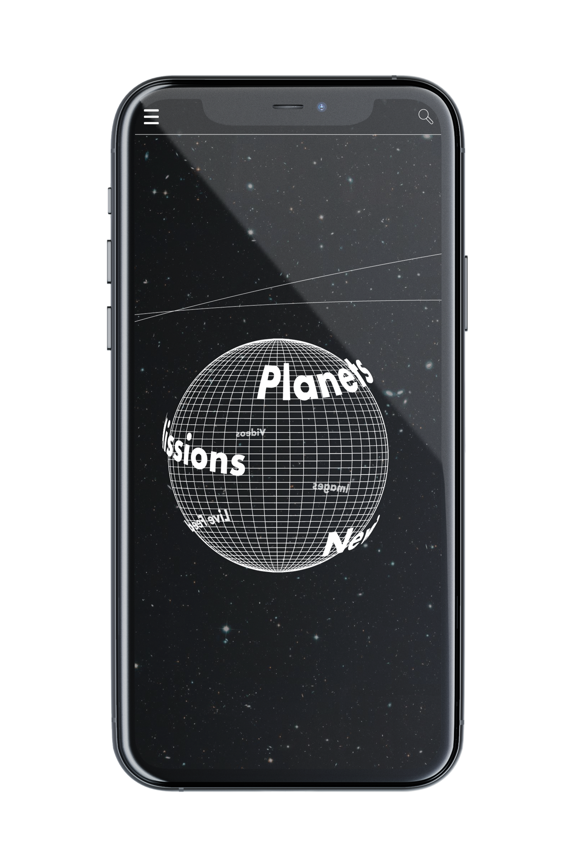
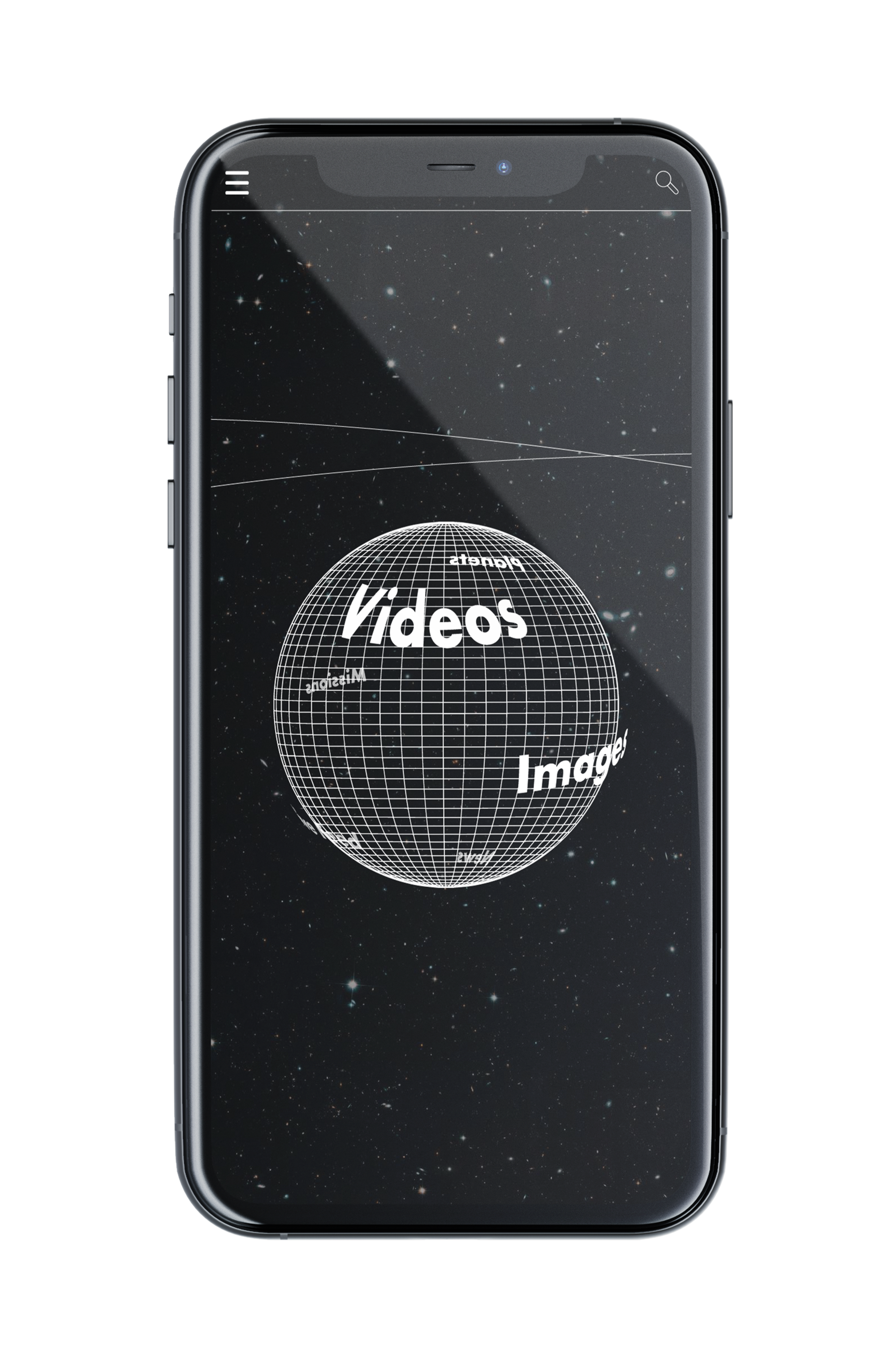
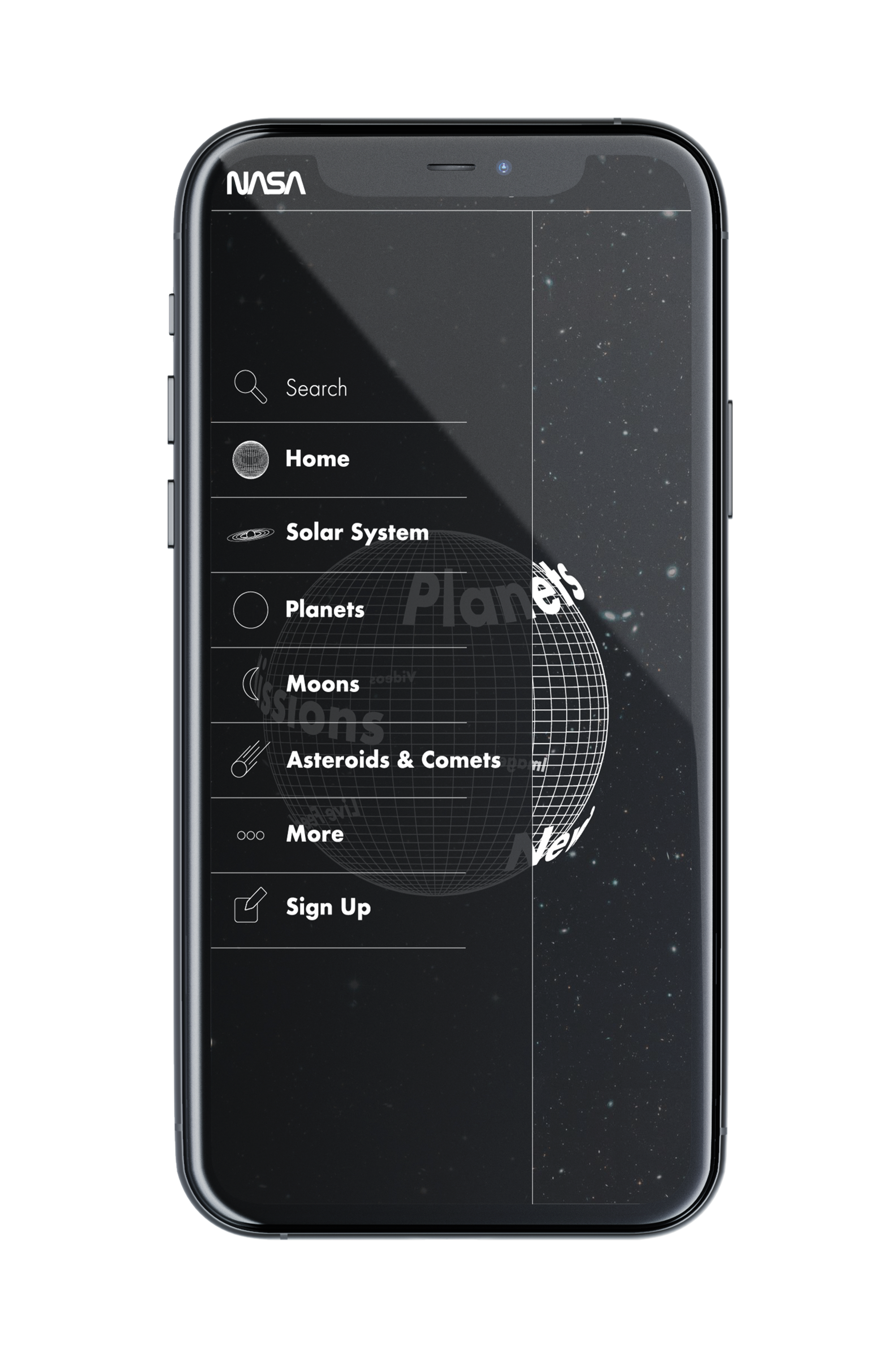
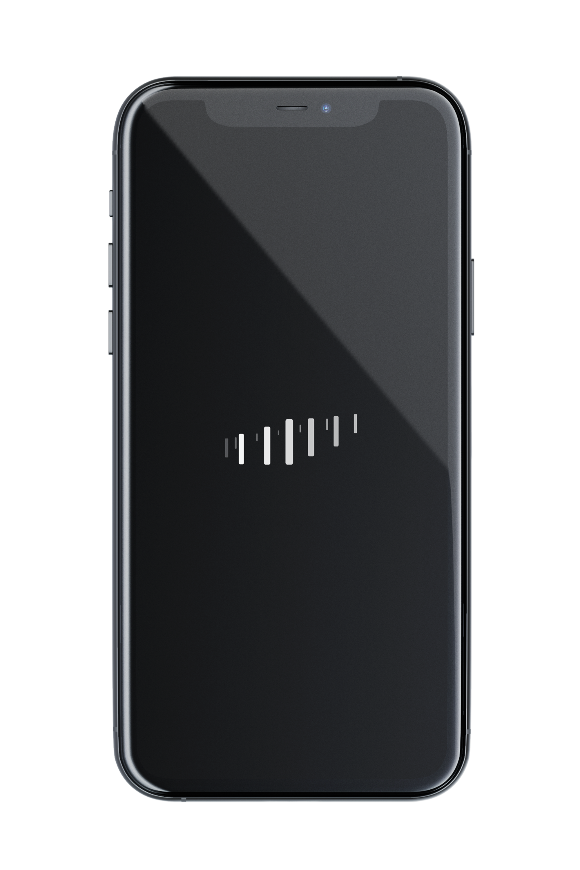
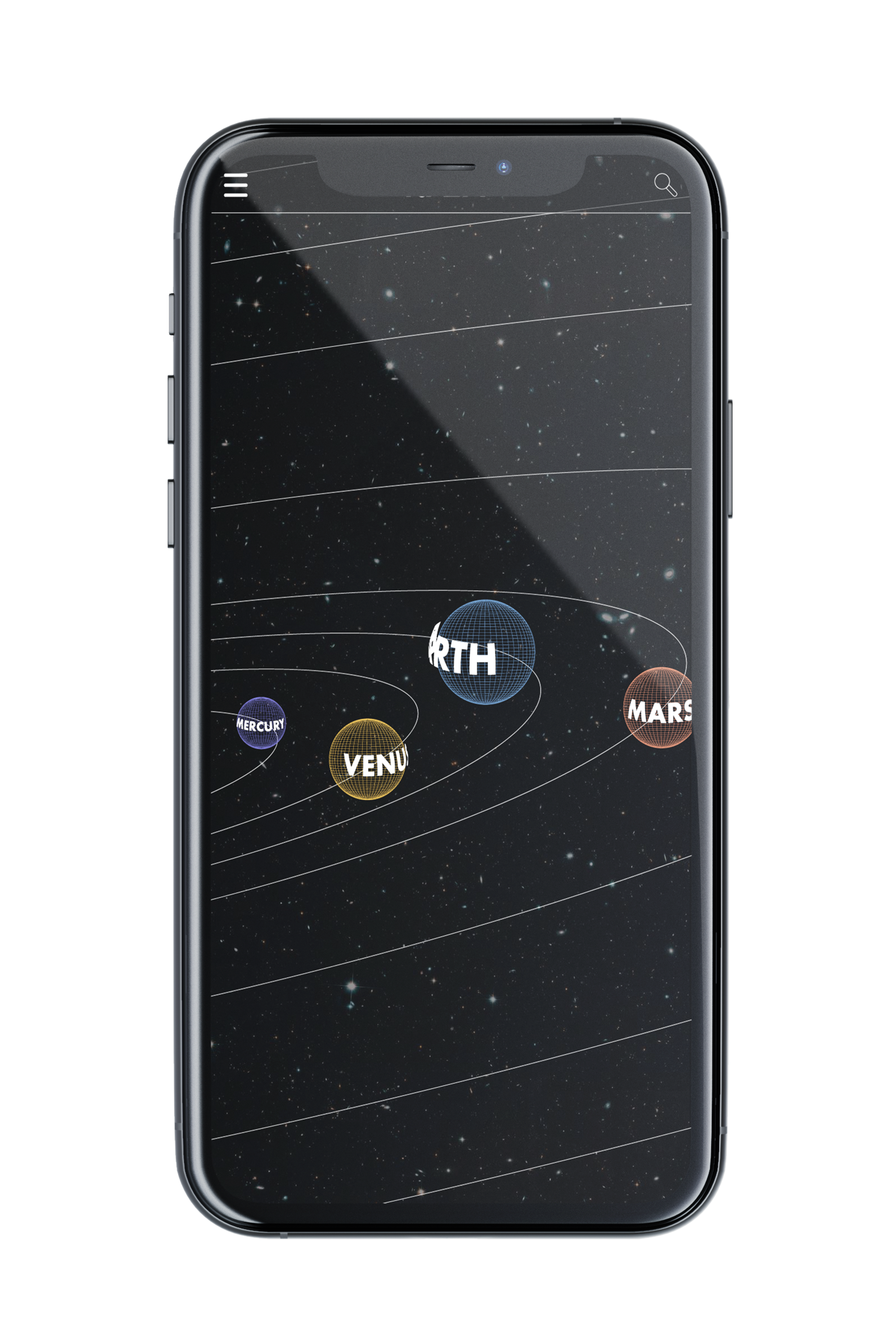
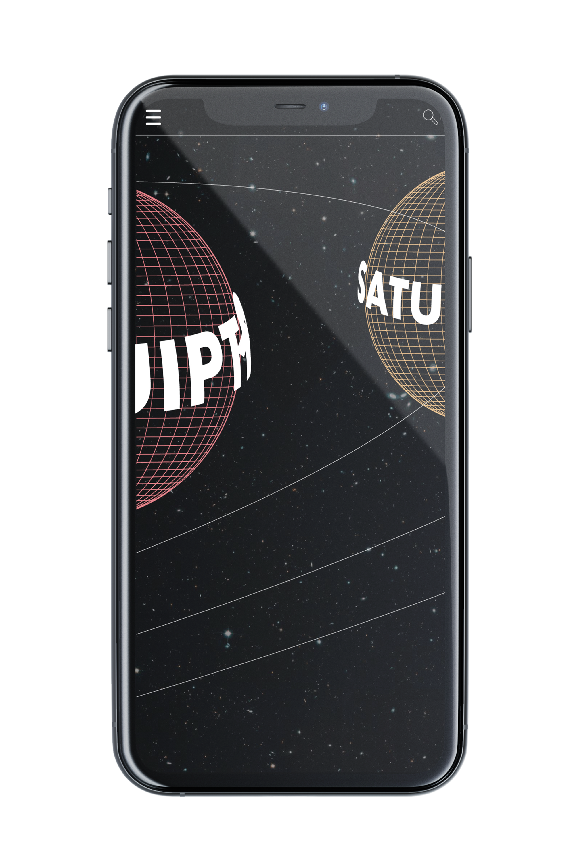
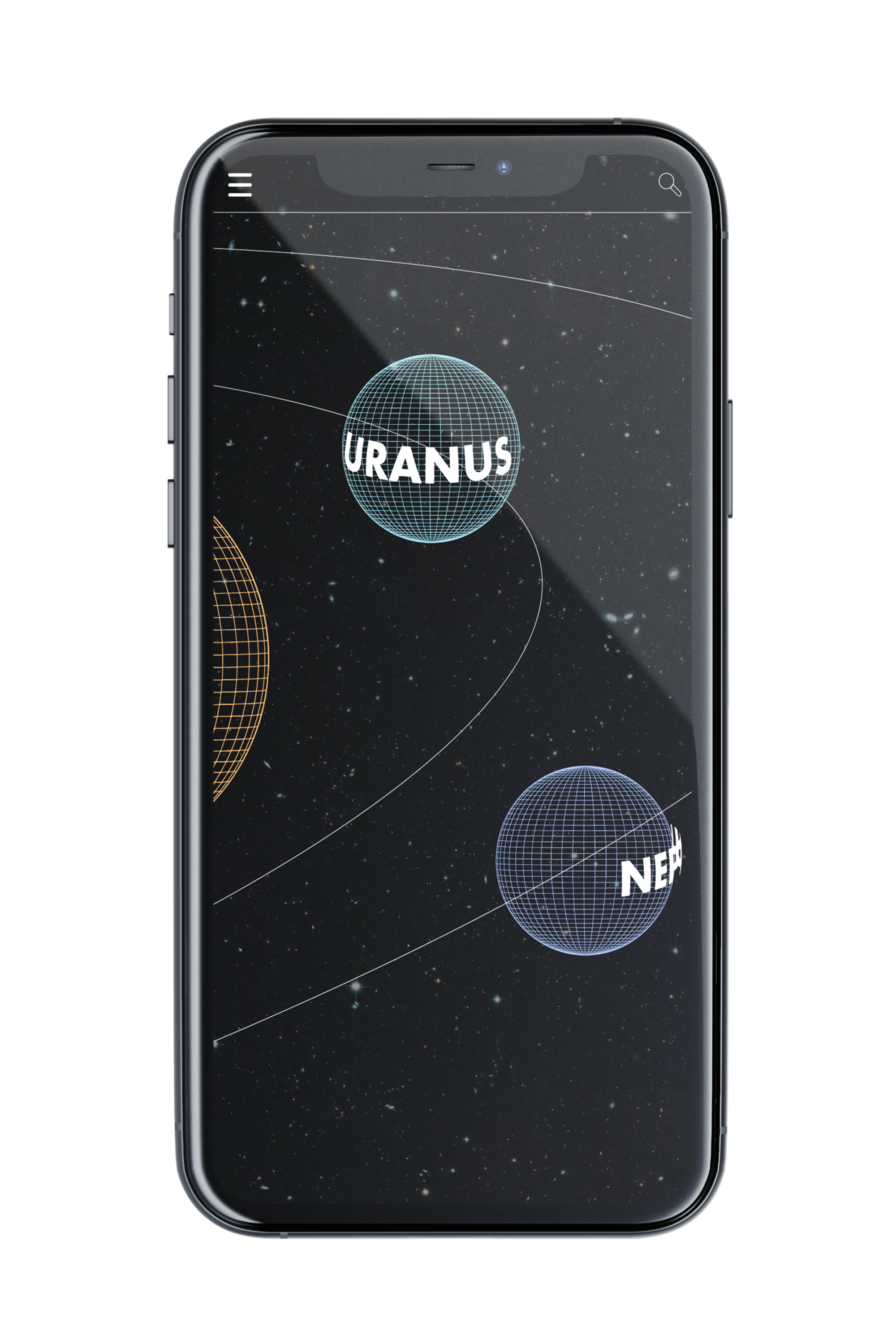
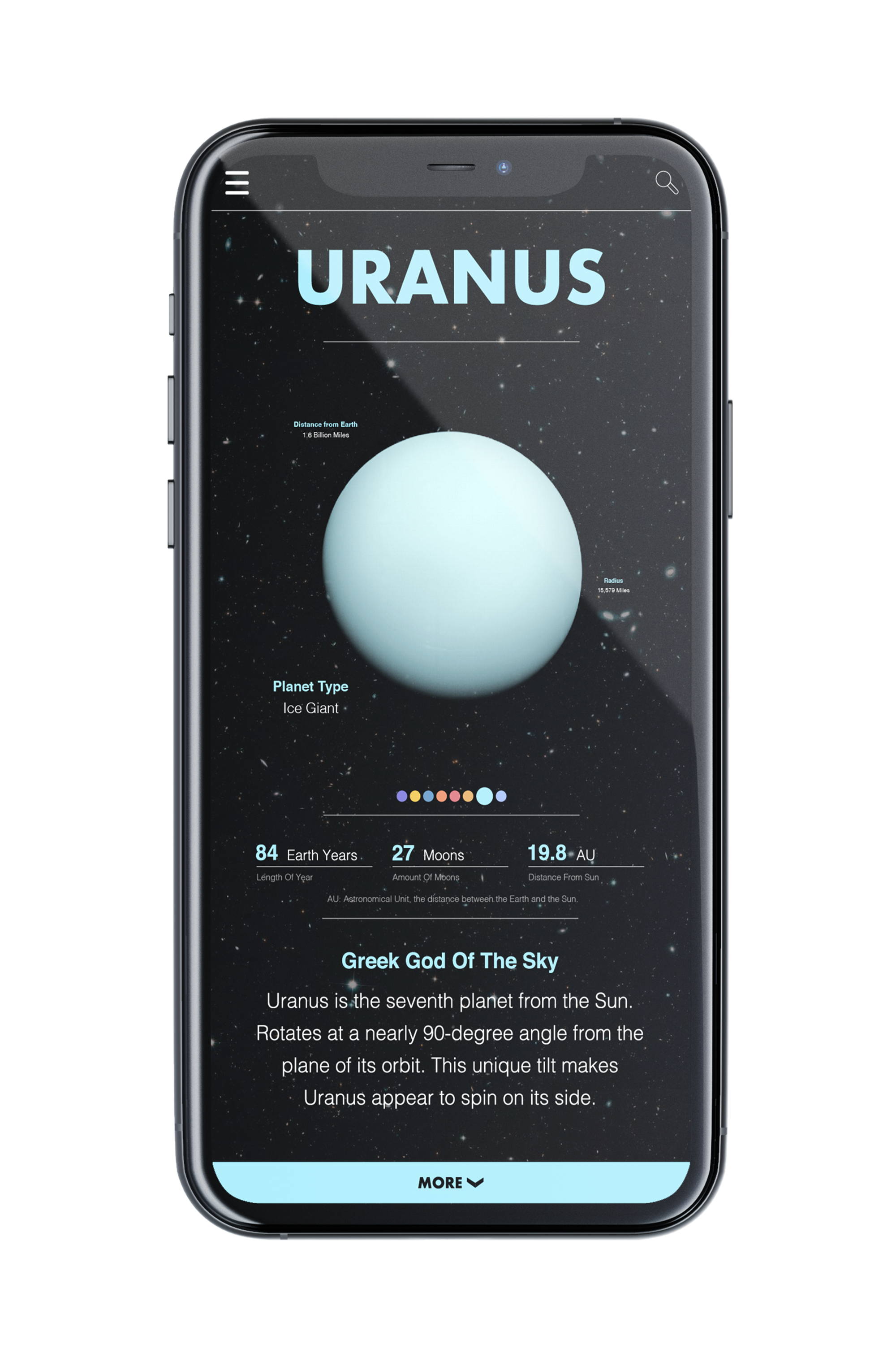
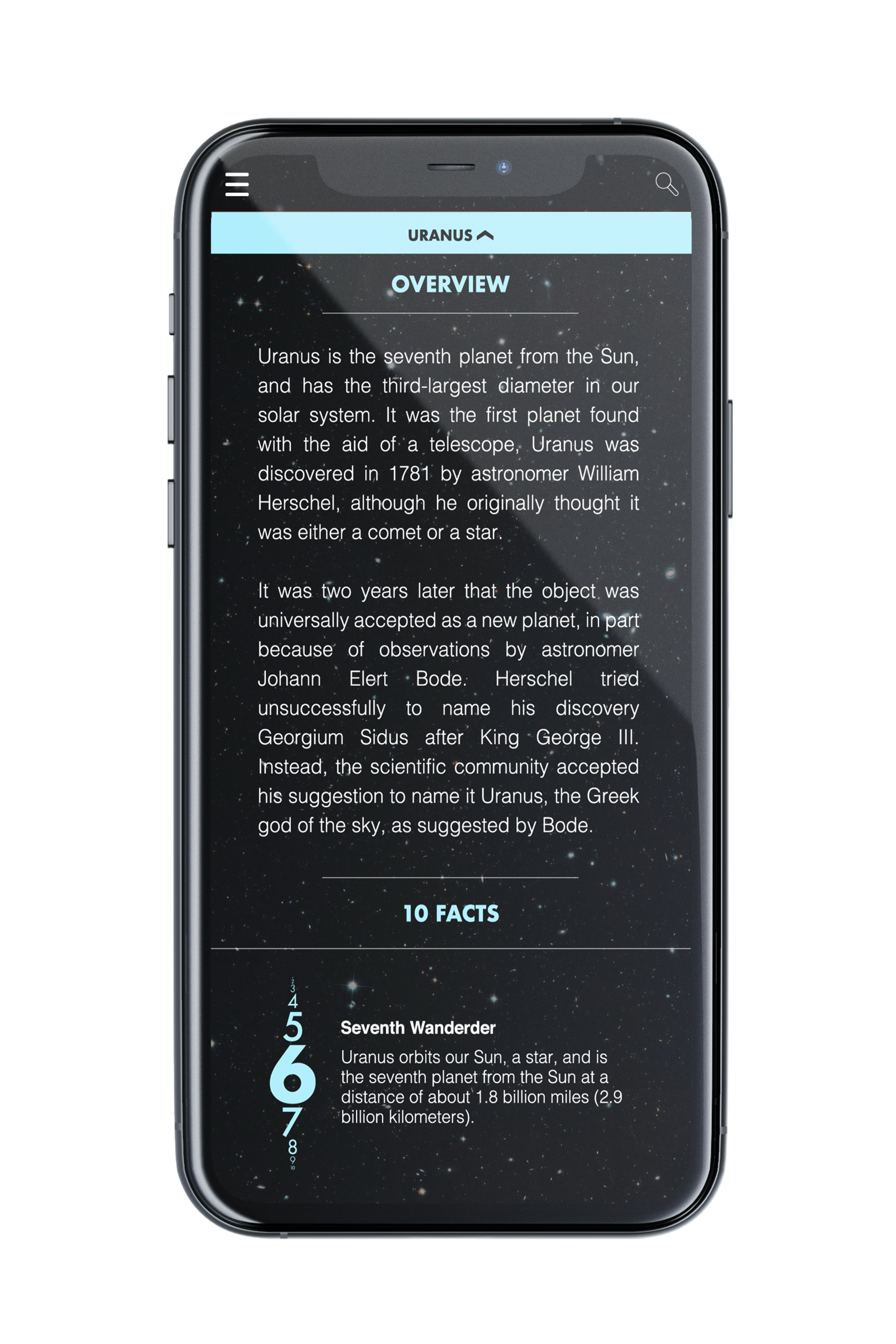
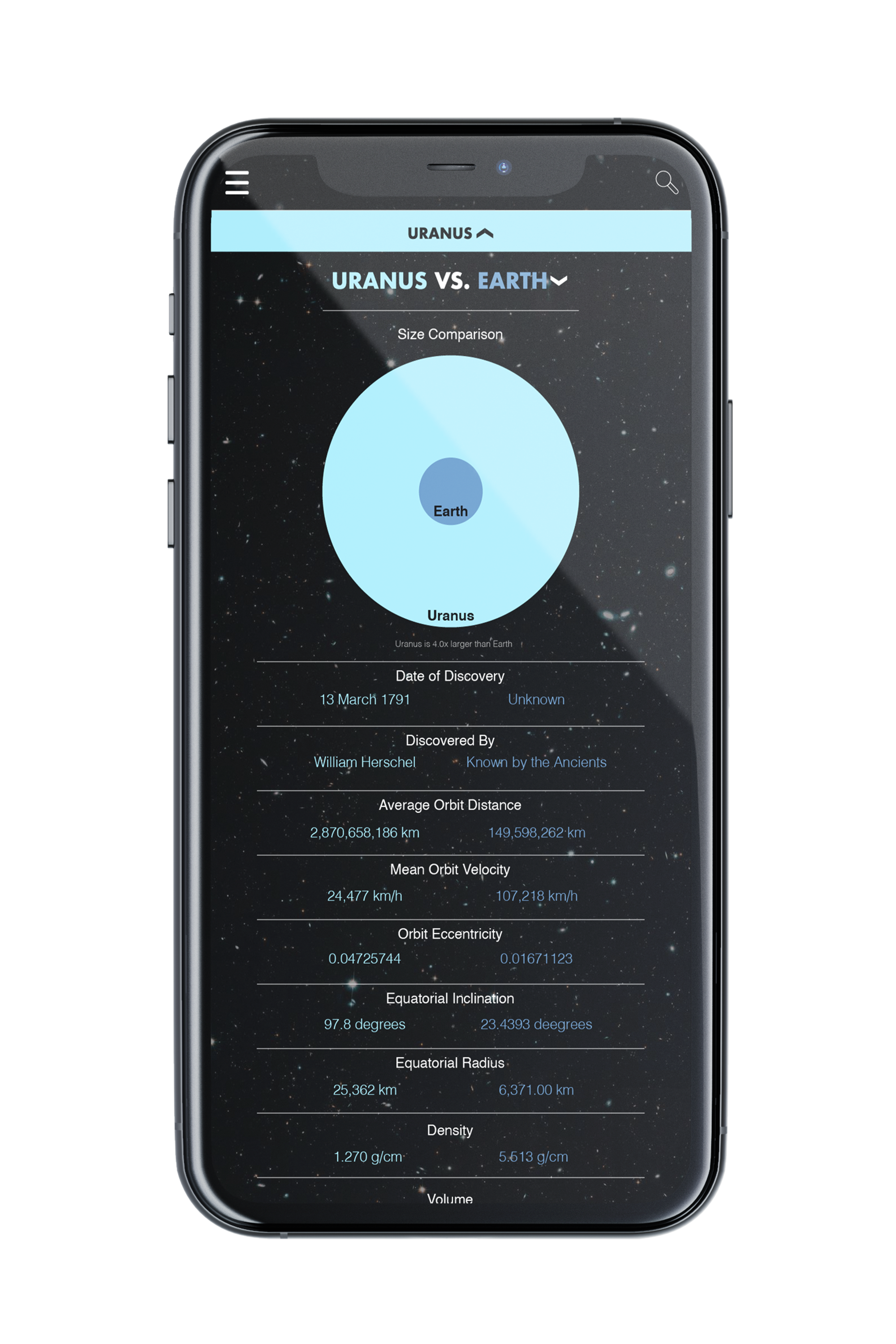
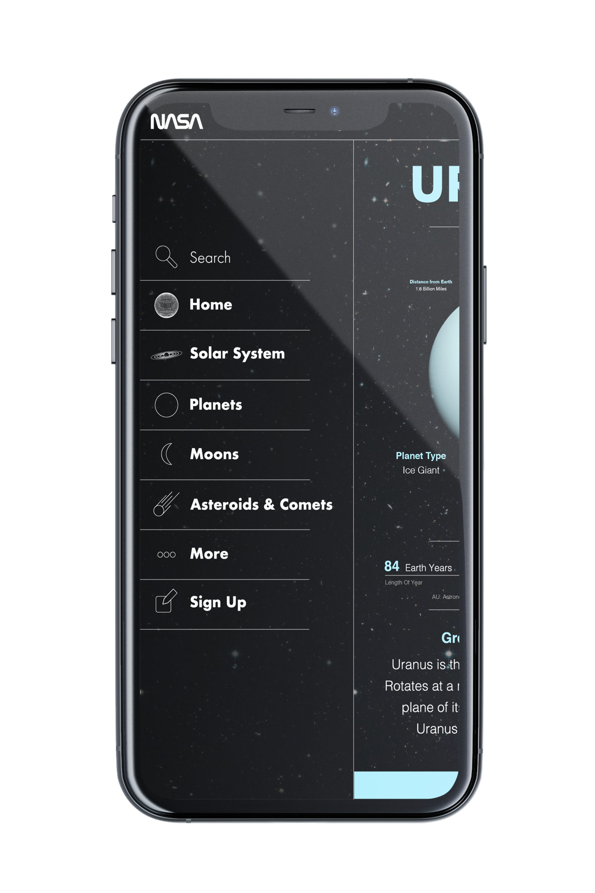
The project here was to redesign the NASA app in a new and interesting way. I gave the whole app a space feel with objects constantly revolving and orbiting around. This gave users the ability to zoom in and out to show the scale of space. I have the main menu act as the sun and the center of the app where you can zoom out to enter the solar system view. One can then click on certain planets to view more information about them. Everything has a mesh style to them in solar system view, but when you click to view more it loads in the texture and gives the planets life. You can easily get back to the main menu by clicking the NASA logo at the top. The loading screen that plays as you boot up the app gives you a sense of what you are about to enter. This is achieved by giving a normal loading screen animation a 3D feel by having it orbit around rather than go in a circle. I feel this version of the NASA app would suit their audience more because it creates an environment where it is fun to learn about space and promotes the goal of the app, which is to teach viewers about space and the solar system.
Deliverables
Interface Design, Icon Design

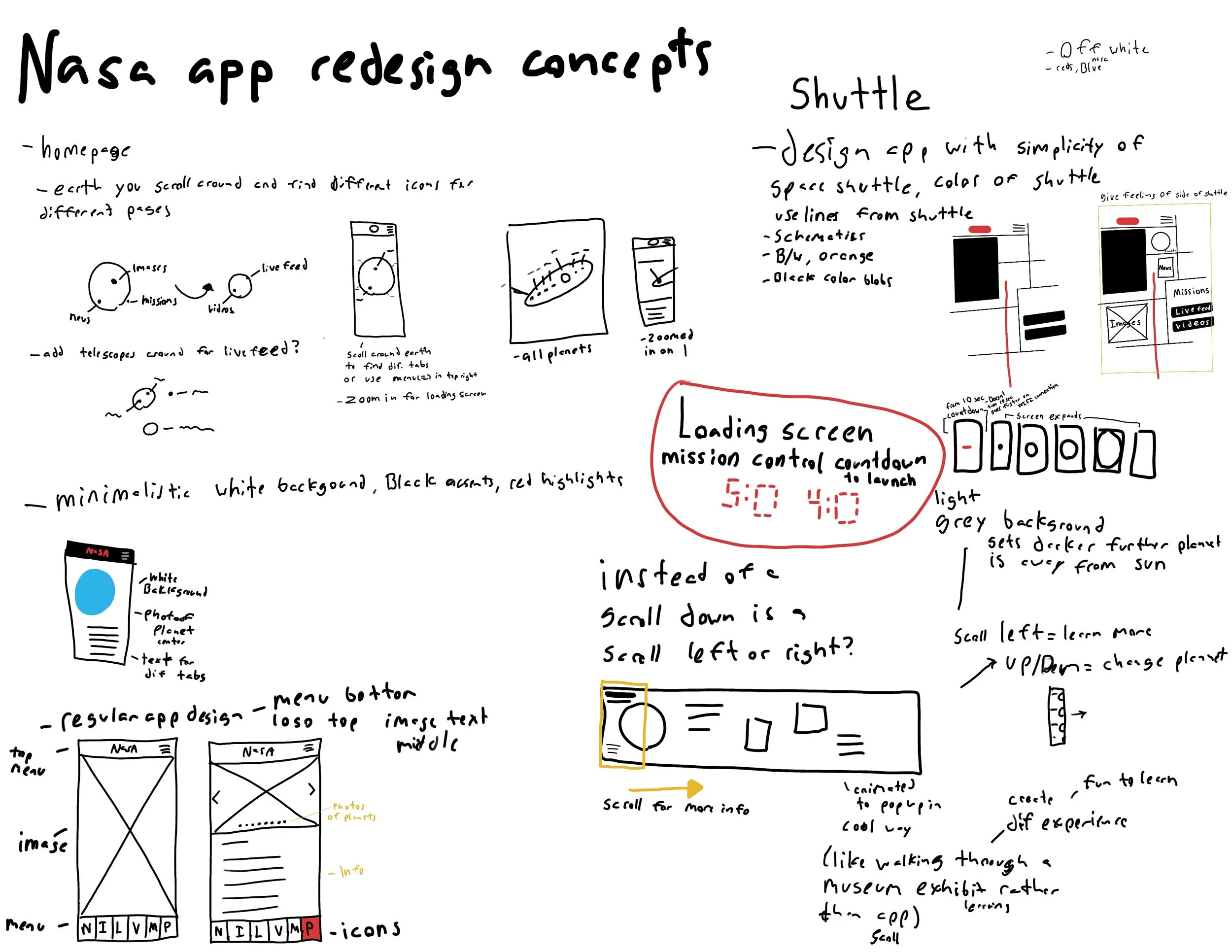
This was my first time doing interface design, so it was tough trying to figure out how I should go about creating an interesting app that people would be willing to come back to. Here is my process book indicating how I went about redesigning the NASA app.